A mock dashboard designed on PowerBI using fictional data.
Introduction:
This is a Sales and Market share analysis data for VanArsdel that manufactures expensive retail products that are sold nationwide as well as in several other countries. This dashboard compares the market share analysis data between the following companies:
VanArsdel
Aliqui
Currus
Natura
Prium
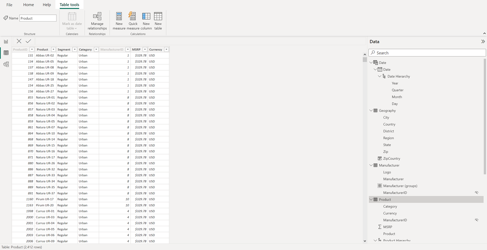
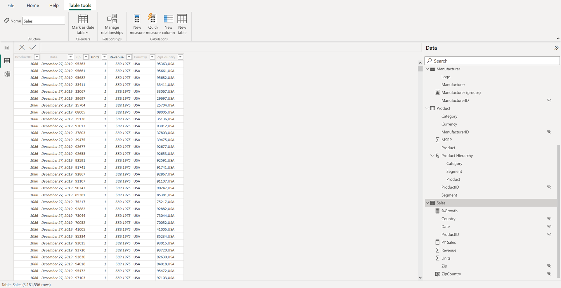
The following data fields were handed over for building the dashboard and the dataset ranged from 2013-2019.
Date
Geography
Manufacturer
Product
Sales
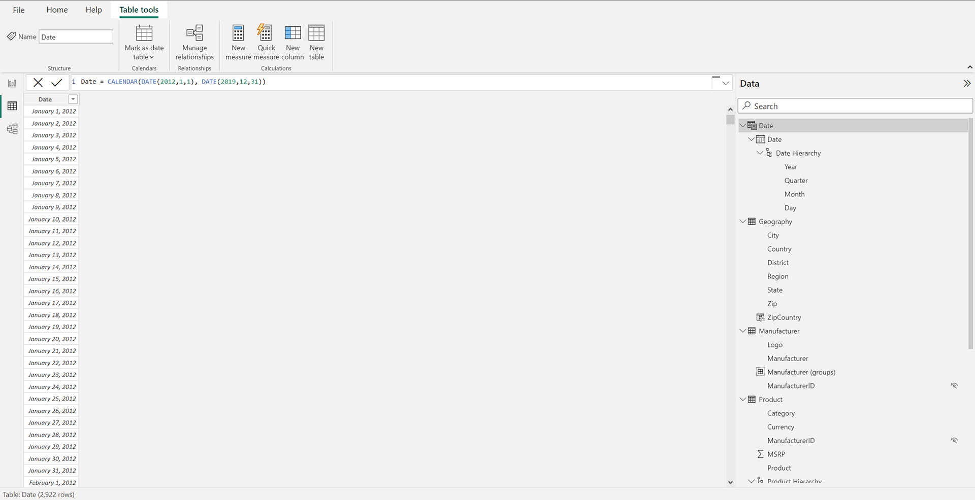
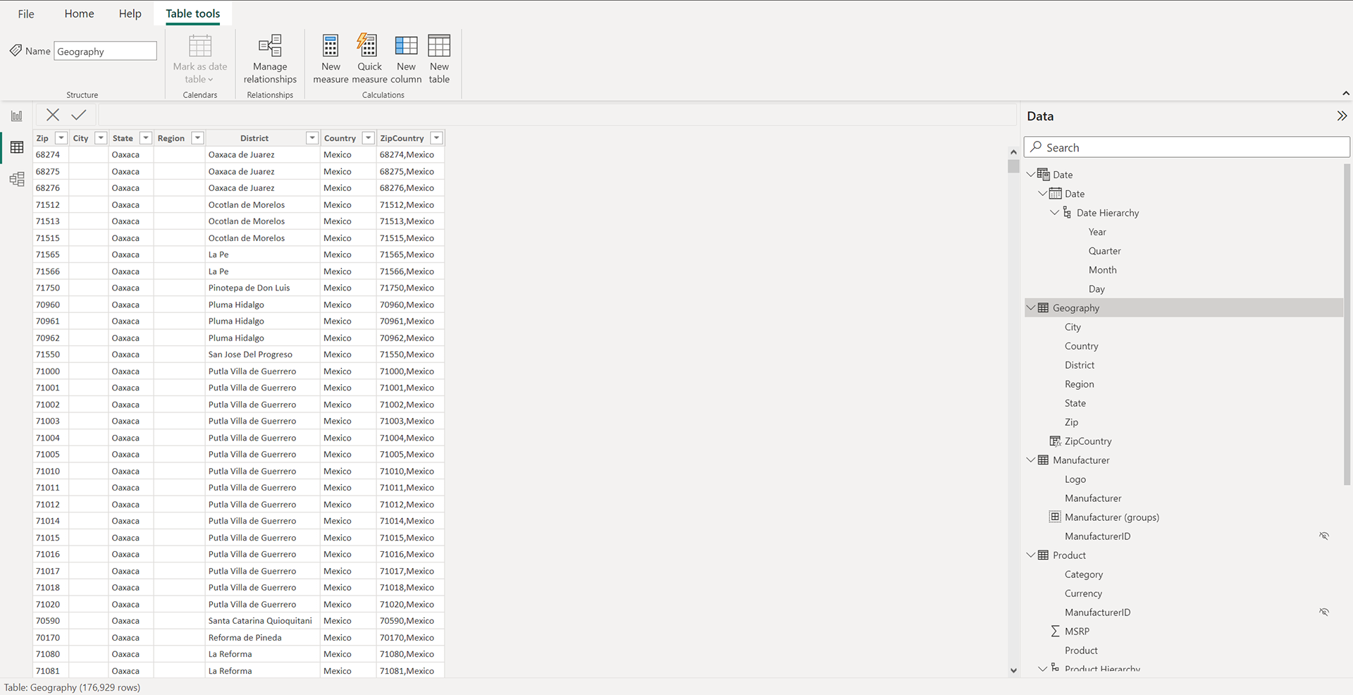
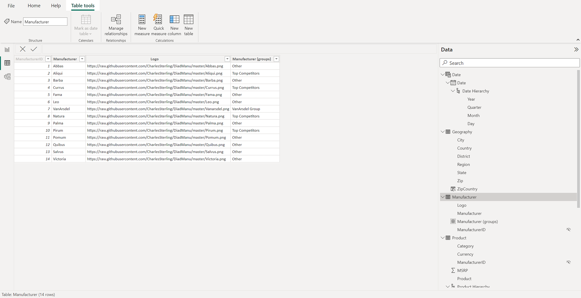
Modelling the Data:
Some common data points were selected together based on their dependencies.
Power Query Editor:
To make sure all the data tables had consistent fields throughout, all the data was edited and combined in the Power Query Editor in PowerBI. Some operations performed were as follows:
1. Ensuring all data columns had the right data type
2. Append Query function to add all the country names to one final sales table
3. Filtering date to only include data from the last 3 years
Building the Report:
In the report pane the following visualizations were made:
1. % Sum of Revenue by Category: This visualization shows the % sum of Revenue based on the Category, Segment and Products.
2. The Matrix visualization has been used to display the category, % Sum of Revenue, Sum of Revenue, PY Sales and % Growth.
3. Revenue by Country and Manufacturer
4. Sum of Revenue by Manufacturer
5. Revenue by Year and Manufacturer
6. The Card visual is used to display the Total Revenue of the selected firm
Conclusion:
The dashboard gives a comprehensive picture of all the relevant data to compare the Annual Revenue for all the selected manufacturers. It is clear from the dashboard that VanArsdel is the leader in the retail products market and has been for the last 3 years. Based on this data it can be inferred that VanArsdel will most likely continue to enjoy the preeminence.


